Confused.com — Helping customers make confident insurance decisions.

/Impact

Simplified journeys  ·  Improved customer confidence  ·  Scalable UX patterns

/Role

Lead Product Designer — covering Product Design, UX Strategy and Native Mobile.

/Focus

Product Design  ·  UX Strategy  ·  Native Mobile

Helping customers navigate a complex financial decision with greater confidence — while balancing commercial objectives, regulatory requirements and the needs of multiple insurance providers.

Confused.com wanted to improve the mobile experience for one of the UK's leading insurance comparison platforms. The challenge wasn't simply making the journey shorter. It was helping customers navigate a complex financial decision with greater confidence while balancing commercial objectives, regulatory requirements and the needs of multiple insurance providers.

As Lead Product Designer, I helped redesign key parts of the mobile experience, simplifying complex journeys and improving clarity without compromising trust or the underlying business model.
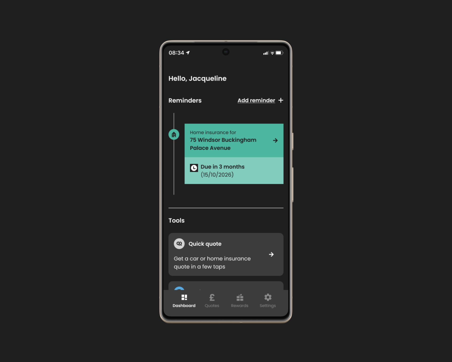
Confused.com mobile app flow overview

The app dashboard — policy reminders and quick quote access from a single personalised home screen.

Buying insurance is a high-trust decision.

Customers are asked to answer detailed questions, compare unfamiliar products and make financial decisions that can have long-term consequences. Every additional question, unclear interaction or moment of uncertainty increases the likelihood they'll abandon the journey.

At the same time, comparison platforms have competing priorities. The experience must support customer confidence while meeting insurer requirements, commercial objectives and regulatory expectations.

The challenge wasn't simply reducing the number of steps. It was reducing the mental effort required to complete them.

Reducing friction throughout the quoting journey.

Helping customers make confident insurance decisions.

Balancing commercial objectives with customer trust.

Creating scalable UX patterns for future product improvements.

Reduce effort without reducing trust.

/01

Simplify decisions, not information

Insurance is naturally complex, but the experience didn't need to feel overwhelming.

Rather than removing important information, I focused on improving hierarchy, progressive disclosure and content structure so customers could understand what mattered at each stage without feeling overloaded.

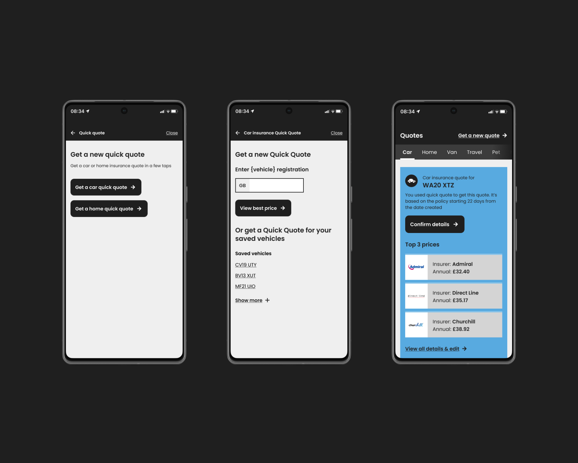
/One decision at a time — complexity reduced at entry, information preserved where it matters Car insurance Quick Quote Get a car quick quote Get a home quick quote /Entry point Two clear choices Car insurance Quick Quote Enter your registration GB AB12 CDE View best price /Single input One thing at a time Top 3 prices AA Insurance £312.50 Admiral £334.00 Churchill £351.20 Show more quotes ↓ /Outcome Clear, ranked results Fewer questions. Same information. More confidence.

User flow: entry → registration → results. One decision at a time.

Three phone screens showing the quick quote journey: entry choice, registration input, and results

Breaking complex insurance journeys into smaller, more manageable decisions through clearer information hierarchy.

/Why this mattered
  • Reduced cognitive load
  • Improved journey clarity
  • Increased customer confidence
/02

Keep customers moving forward

Long-form journeys often fail because people lose momentum rather than because individual screens are difficult.

I redesigned key moments to make progress feel clear and continuous, helping customers stay focused on completing their quote without feeling like they were repeatedly starting over.

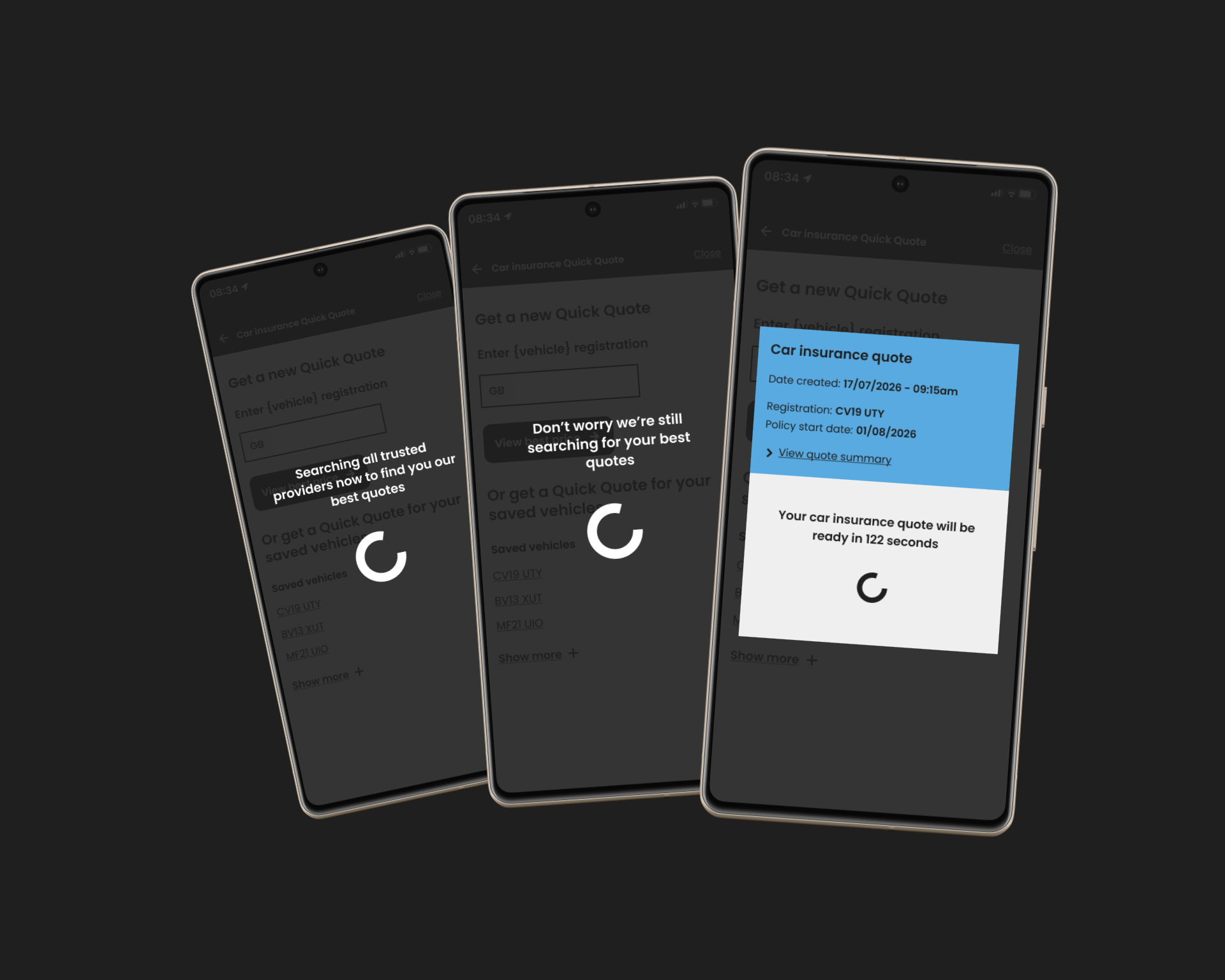
/Loading states redesigned as holding patterns — every screen earns its place in the journey Car Quick Quote Enter your reg AB12 CDE View best price /Submit We're fetching your details Finding your best quotes /Reassurance 1 Don't worry we're still searching Ready in 122s Searching all providers /Reassurance 2 Top 3 prices AA Insurance £312 Admiral £334 Churchill £351 Confirm details /Outcome Loading states aren't dead time — they're an opportunity to maintain trust.

Loading states as reassurance — searching, still searching, and quote ready. Each screen earns its place.

Three phones showing the loading reassurance states: searching all providers, still searching with a progress bar and time estimate, and a quote ready modal

Designing smoother transitions between stages to maintain momentum throughout the quoting journey.

/Why this mattered
  • Reduced unnecessary friction
  • Improved journey continuity
  • Better completion experience
/03

Balance business goals with customer confidence

Comparison platforms rely on commercial partnerships, but commercial priorities should never undermine trust.

Throughout the redesign I looked for opportunities to support business objectives while ensuring customers understood their options and remained confident in the decisions they were making.

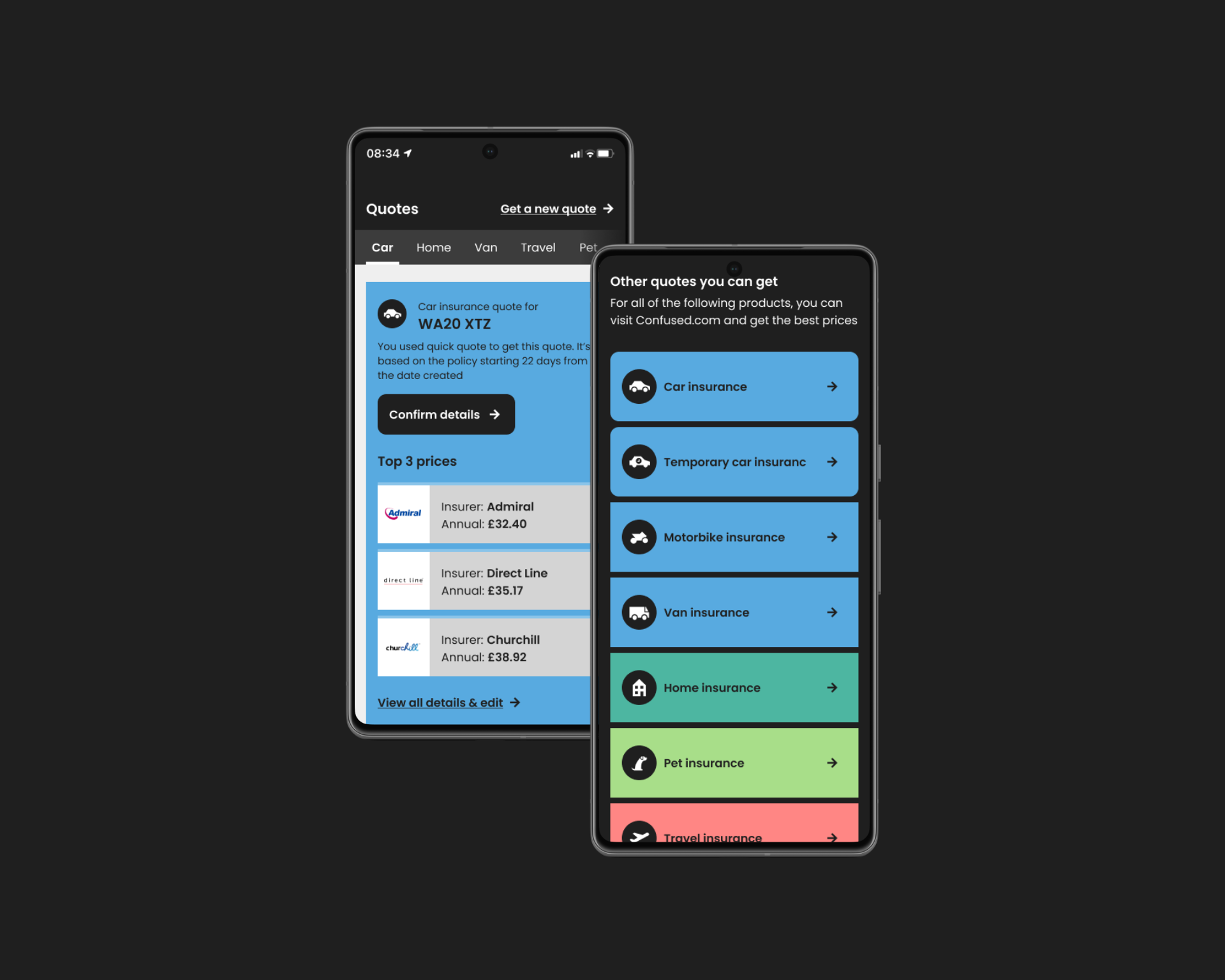
/One results screen. Two jobs: customer confidence + commercial growth. Your car insurance quotes Results screen Top 3 prices AA Insurance £312.50 Admiral £334.00 + 14 more quotes Other quotes you can get Home Pet Travel Van Life Energy 12 product categories Confirm details Customer converts Confident decision made Explore other products Commercial opportunity No disruption to primary flow /Customer trust layer /Commercial layer Both paths serve the customer. Only one also serves the business.

Results screen — top 3 prices for confidence, cross-sell below the fold.

Phone screens showing the results page with top 3 prices and cross-sell insurance options

Balancing commercial requirements with a transparent and trustworthy customer experience.

/Why this mattered
  • Protected customer trust
  • Supported commercial objectives
  • Created reusable UX patterns
/Customer

A simpler, clearer mobile experience that helped customers navigate complex insurance decisions with greater confidence.

/Business

A stronger foundation for future product improvements that balanced customer needs with commercial and regulatory requirements.

/Team

Established clearer UX patterns and interaction principles that could be reused across future journeys.

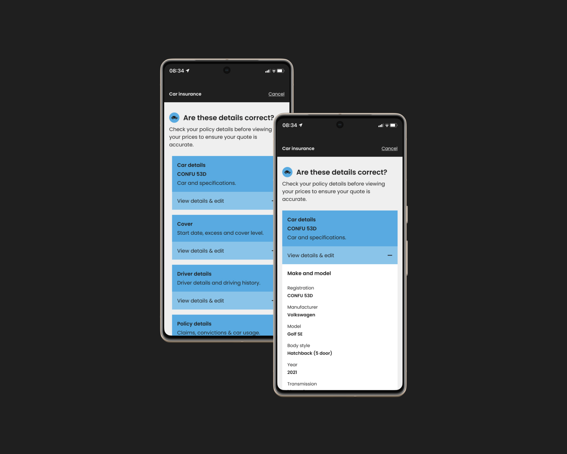
Two phone screens showing the policy detail confirmation step — grouped expandable sections with an inline expanded car details view

Policy detail confirmation — grouped sections let customers check what matters without wading through everything at once.

Working on Confused.com reinforced an important lesson about designing for regulated products.

People rarely need less information. They need information presented in a way that helps them make confident decisions.

Good product design doesn't remove complexity. It organises complexity so people can move through it with confidence.

The best financial products don't just simplify decisions. They help people feel confident making them.