Heathrow — Helping airport operations make faster, more confident decisions.

/Role

Lead Product Designer — covering Product Strategy, Enterprise UX and Data Visualisation.

/Focus

Product Strategy · Enterprise UX · Data Visualisation

/Impact

Operational concept · Executive alignment · Product vision

Heathrow wanted to explore how operational data could become easier to understand and act upon. Rather than designing another reporting dashboard, the ambition was to rethink how Power BI could support operational decision making across one of the world's busiest airports.

Working closely with stakeholders, I explored how complex operational data could be transformed into a clearer, more intuitive experience that helped teams move from interpreting information to taking action.
Airport operations generate enormous amounts of live information.

Passenger flow, baggage, security, stand allocation and terminal activity all exist across multiple systems, making it difficult for operational teams to build a complete picture of what is happening.

Traditional dashboards presented large amounts of data, but still relied on people connecting the dots themselves.

The opportunity wasn't simply to visualise more information. It was to help people make better operational decisions with greater confidence.

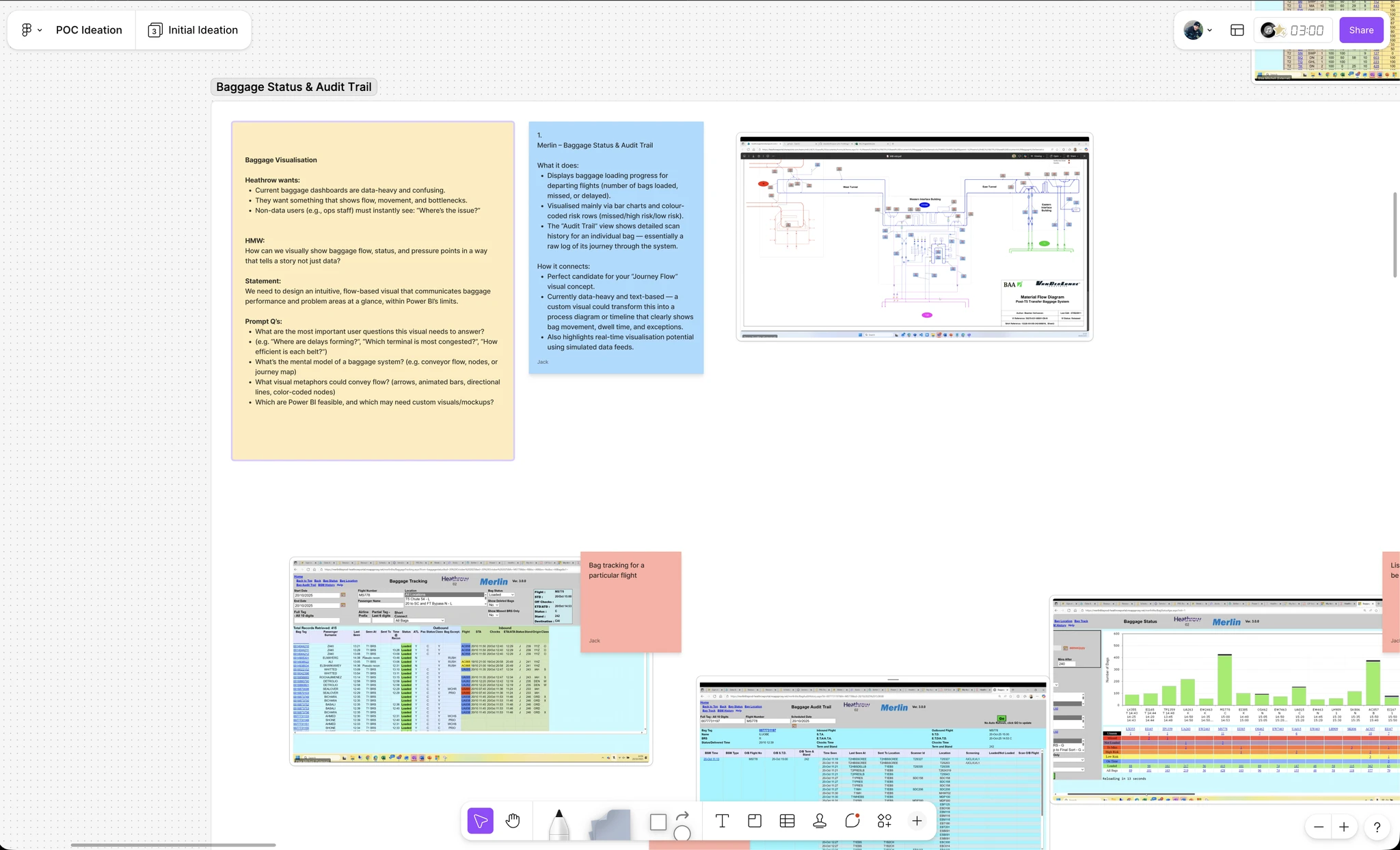
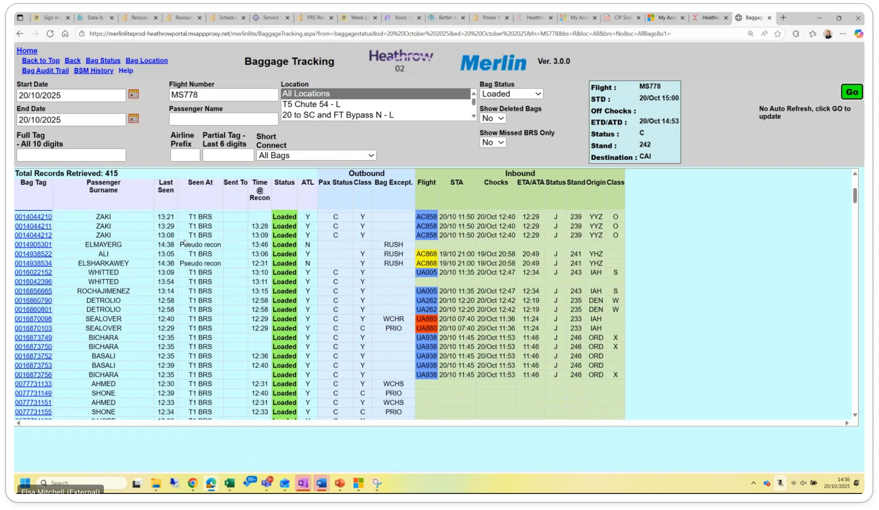
Pre-exploration system

Pre-exploration system revealing cognitive load and limited spatial context for operational decision-making.

Reduced operational effort — less time required to understand what's happening.

Faster problem identification — teams spot issues before they escalate.

Confident decisions — quicker, more assured operational decision-making.

Beyond traditional reporting — demonstrating what enterprise dashboards could become.

Enterprise dashboards shouldn't just report the past. They should help people decide what to do next.

Design around operational workflows, not data sources

Operational teams weren't thinking in databases or reports. They were thinking about flights, passengers, baggage and disruption.

I restructured the experience around the real workflows people followed every day, helping users understand operational context rather than navigate disconnected datasets.

/From alert to action — following the natural operational workflow, not the data model Alert raised Something looks off T3 baggage delay /Alert Something needs attention Investigate Open operational view /Investigate Pull the thread Understand context Root cause surfaced Handler shortage Flight volume spike /Context Why it's happening Make decision Options are visible Redeploy handlers Escalate to ops /Decision What to do next Act Issue contained Resolved /Action Confidence to act Designing around this workflow — not the data model — is what makes the product feel intuitive.

Operational workflow: alert to action. Designing around how teams actually think, not how the data is structured.

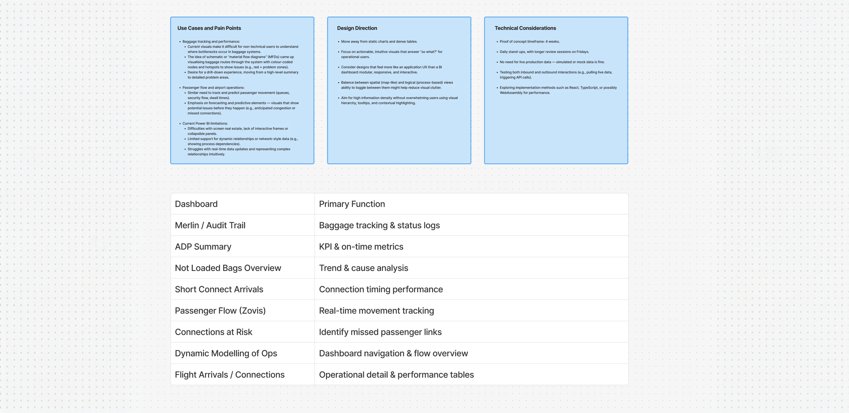
Early workflow mapping

Early workflow mapping used to align operational journeys before exploring interface concepts.

  • Reduced cognitive load
  • Better operational context
  • Faster understanding

Turn complex data into operational awareness

Raw data doesn't create situational awareness. Hierarchy, spatial context and visual emphasis do.

I designed concepts that helped teams see what mattered most at a glance — moving from reporting what happened to showing what needed attention right now.

Operational data concepts

Concepts exploring how operational data could become easier to interpret through clearer hierarchy and spatial awareness.

  • Improved situational awareness
  • Faster issue recognition
  • Better decision confidence

Prototype the future before building it

Rather than writing specifications, I built lightweight concept prototypes to make the future feel tangible.

This gave stakeholders something to react to, helped surface assumptions early, and created a shared reference point for what the product could become.

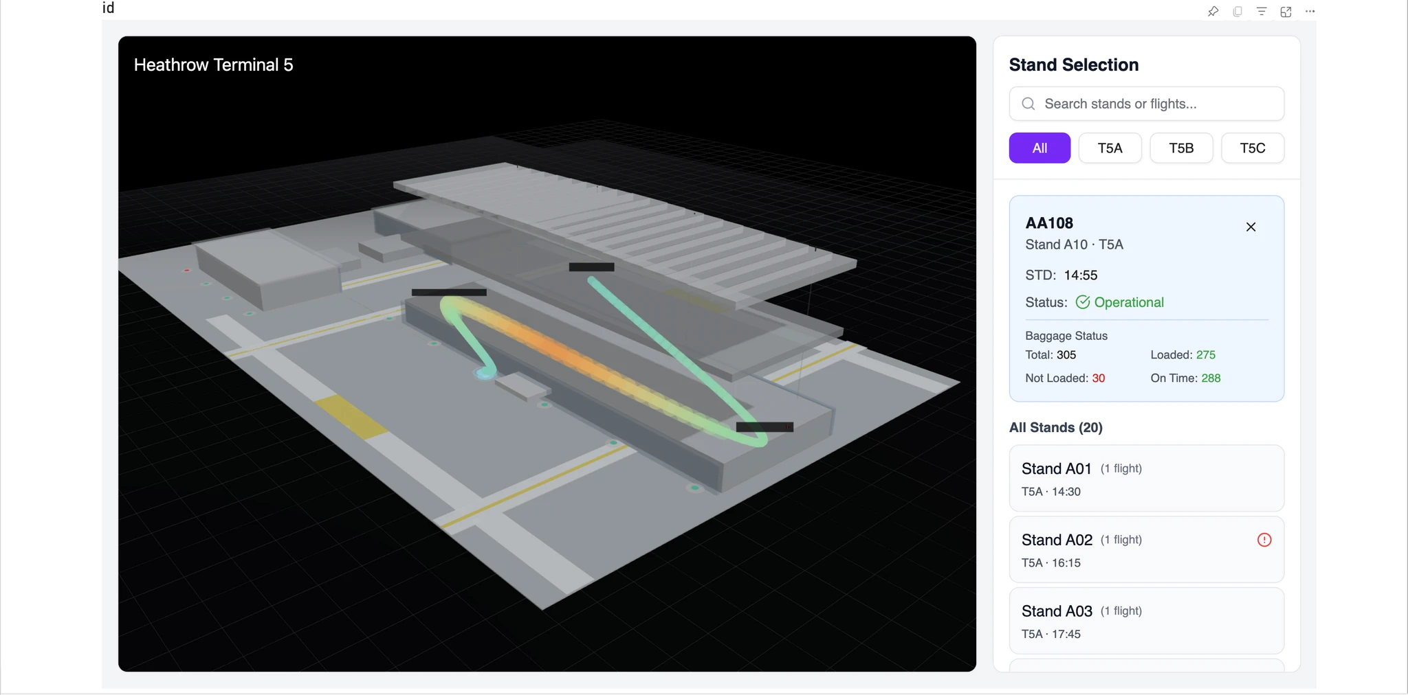
Concept prototypes

3D geospatial prototype embedded within Power BI, visualising stand-level baggage performance in real time.

  • Reduced product risk
  • Aligned stakeholders early
  • Informed future roadmap discussions
/Customer

Operational teams had a clearer, more intuitive way to engage with live data — reducing the mental effort required to understand what was happening and what needed attention.

/Business

Heathrow gained a tangible product vision — one they could take to leadership, align around, and use to inform future investment decisions in their data and analytics capabilities.

/Team

The process demonstrated the value of working from operational reality outward — and gave the broader team a reusable pattern for approaching complex enterprise data challenges.

Open discussion on the process of translating operational complexity into product clarity — and what it takes to align stakeholders around a future vision.

What made this engagement different wasn't the technology — it was the framing. Starting from how people actually think and work, rather than what data is available, changed everything about the design direction.

Enterprise BI is often treated as a reporting problem. This project was a reminder that it's really a decision-making problem. The goal isn't to surface more information — it's to reduce the work required to act on it.

Good enterprise software doesn't show everything. It highlights what matters most.